")
Google Sheets is a powerful tool to interpret datasets, especially using charts. One such feature to interpret offered by Google Sheets is the line of best fit. A line of best fit is a straight line that best represents the relationship between two sets of data. It can help you understand the trend, correlation, and prediction of the data. Hence, to use this feature on Google Sheets, this guide will help you.
Google Sheets: How to Add Line of Best Fit (2023)
The line of best fit is added to the Scatter Plot chart on Google Sheets by enabling ‘Trendline’ from the Chart Editor, and here’s how you can do it:
1. Create a Scatter Plot Chart
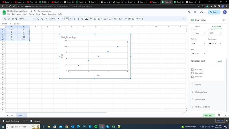
- To create a Scatter Plot, you need to have two columns of data that represent the x and y values of each point.
- After creating the dataset select the columns, then click the ‘Insert’ option from the toolbar.
- Now click the ‘Chart’ icon.
- Google Sheets will automatically detect the chart type as a Scatter plot.
- If some other chart type is represented on the screen, click the ‘Chart Type’ drop-down and select the ‘Scatter chart’ option.
2. Enable Trendline
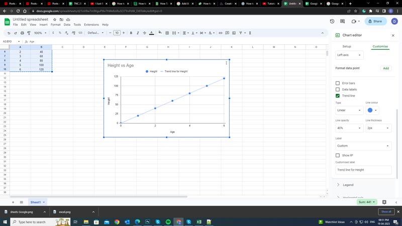
- Click the Customize tab on the ‘Chart Editor’ panel and expand the ‘Series’ tab.
- Then click the ‘Trendline’ checkbox.
- Now you can choose from different types of trendlines, such as linear, exponential, polynomial, etc. Select the trendline appropriate to your Scatter plot chart.
- Also, you can customize the appearance and label of the trendline by changing the options like color, opacity, label, and more.
- Finally, you can now interpret your data more easily with the line of best fit.
That’s everything covered on How to add the line of best fit on Google Sheets. Also, check out our other guides, such as How to create a Pivot Table in Google Sheets or How to Combine Text from two cells in Google Sheets.